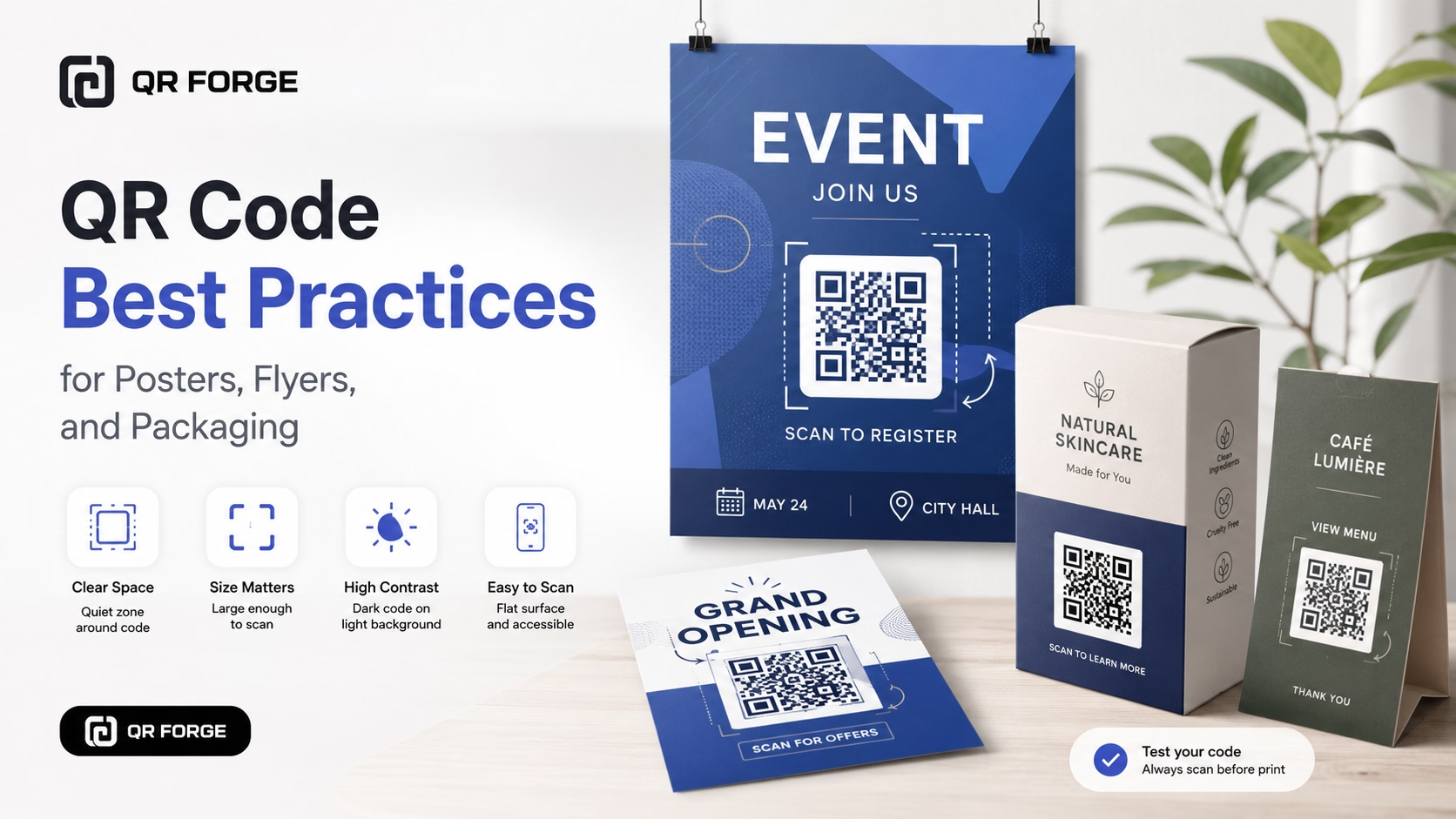
A QR code works best when people can notice it, understand it, scan it quickly, and reach a useful destination.
Many printed QR codes fail because they are too small, placed on busy backgrounds, cropped too tightly, printed with poor contrast, or shown without a clear call to action.
This guide covers practical QR code best practices for posters, flyers, packaging, menus, business cards, signs, and other printed materials.
Create a clean QR code
Generate a high-contrast QR code, then use these best practices before placing it into your final design.
Start with one clear goal
Before creating the QR code, decide what the user should do after scanning.
Good QR code goals
Examples include:
- visit a website
- view a product page
- join WiFi
- open a menu
- start a WhatsApp chat
- save contact details
- book an appointment
- register for an event
Avoid unclear destinations
Do not send users to a generic page with no obvious next step. The destination should match the message printed near the QR code.
Use a clear call to action
A QR code without context forces people to guess what it does.
Good examples
Use labels such as:
- Scan to order
- Scan for details
- Scan to join WiFi
- Scan to view the menu
- Scan to book
- Scan to chat
- Scan to save contact
Match the destination
If the label says “Scan to download,” the QR code should open the correct file or download page.
The best call to action tells the user both what to do and what they will get after scanning.
Choose the right QR code size
Size affects scan reliability.
Close-range materials
Business cards, brochures, small labels, product inserts, menus, and receipts can use smaller codes.
For many close-range printed uses, around 2 x 2 cm is a practical minimum.
Medium-distance materials
Flyers, table tents, counter signs, and notice boards usually need larger QR codes.
A range of 3 x 3 cm to 5 x 5 cm is often a safer starting point.
Long-distance materials
Posters, banners, wall signs, presentation screens, and event displays require much larger codes.
The farther away people stand, the larger the QR code should be.
Preserve the quiet zone
The quiet zone is the empty margin around the QR code.
Do not crop too closely
Leave clear empty space around all four sides.
Keep nearby elements away
Do not place text, borders, icons, or decorative shapes too close to the code.
Treat empty space as functional
The quiet zone is part of the scannable design, not wasted space.
Use strong contrast
Black on white remains the safest combination.
Safe color combinations
A dark QR code on a light background usually works best.
Avoid low contrast
Avoid light gray on white, pale colors on light backgrounds, dark colors on dark backgrounds, gradients, and transparent overlays on photos.
Test custom colors
If you use brand colors, test the final version on multiple phones.
Keep the QR code square
A QR code should remain perfectly square.
Lock the aspect ratio
Enable aspect ratio lock in your design tool.
Avoid non-square frames
Do not squeeze the QR code into a narrow or wide container.
Re-export if distorted
If the image has already been stretched, generate a fresh QR code.
Use a clean background
Busy backgrounds make QR codes harder to detect.
Avoid placing directly on images
Photos, patterns, textures, and gradients can reduce clarity.
Add a solid background box
Use a plain white or light-colored box with enough quiet zone.
Check transparency
A transparent QR image may look different after being placed in the final design.
Use a suitable file format
PNG
PNG works well for most digital and print uses.
SVG
SVG is ideal when the QR code needs to be resized in a design tool.
JPEG
JPEG is less suitable because compression can blur edges.
Do not use screenshots
Download the original QR image instead of taking a screenshot.
Use stable destination data
A QR code can scan perfectly but still fail if the destination is wrong.
Check every URL
Confirm the domain, page path, HTTPS, redirects, mobile usability, and page availability.
Check contact details
Verify phone numbers, email addresses, WhatsApp numbers, and vCard fields.
Check WiFi details
Verify the network name, password, security type, and capitalization.
Prefer stable pages
Avoid temporary destinations you expect to remove soon.
Keep encoded data concise
Long data creates denser QR patterns.
Use clean URLs
Remove unnecessary parameters when they are not needed.
Keep messages short
Use concise WhatsApp, SMS, and email messages.
Increase size for dense codes
If long data cannot be avoided, make the QR code larger.
Best practices for posters
Make the QR code large
A tiny QR code on a large poster is difficult to use.
Place it within reach
Avoid placing it too high, too low, or somewhere unsafe to approach.
Keep it away from clutter
Use a clean area with strong visual separation.
Test from the viewer's position
Stand where the audience will stand and scan the final poster.
Best practices for flyers
Use enough size
A QR code between 3 x 3 cm and 5 x 5 cm is often easier to scan than a tiny corner code.
Do not hide it
Place it near the main offer or next step.
Keep the call to action close
The instruction and QR code should feel like one element.
Test the printed flyer
Print one proof before producing many copies.
Best practices for packaging
Packaging may be curved, glossy, textured, folded, or damaged.
Avoid curves when possible
Do not place the QR code on a tight bottle curve or tube edge.
Keep away from seams and folds
Avoid box folds, package seams, tear lines, lid edges, and trimming zones.
Consider handling damage
Place the code where it is less likely to be scratched or torn.
Watch for glossy glare
Test the real package under actual lighting.
Use a larger code on difficult surfaces
Curved, textured, or reflective packaging benefits from a larger QR code.
Best practices for menus
Use a visible placement
Good locations include table tents, menu covers, counter signs, receipt holders, and table stickers.
Keep the destination fast
The menu page should load quickly and work well on mobile.
Avoid glare
Test laminated menus and glossy surfaces in the actual environment.
Include a fallback
Provide a short URL or staff assistance when possible.
Best practices for signs and banners
Increase size significantly
Do not reuse a flyer-sized QR code on a banner.
Use simple layouts
Keep the QR area free from decorative interference.
Give people space
Place signs where users can stop and scan comfortably.
Avoid moving surfaces
QR codes on moving vehicles or swinging signs are difficult to scan.
Best practices for digital screens
Use enough screen time
Do not display the QR code for only a few seconds.
Increase brightness and contrast
Reduce reflections and keep the code clear.
Avoid animated backgrounds
Movement behind the code can interfere with focus.
Provide a clickable alternative
If users may view the content on the same phone, include a normal link or button too.
Add branding carefully
Use color conservatively
Use dark brand colors on a light background.
Keep logos small
A centered logo can work when it does not cover too much of the pattern.
Do not cover finder patterns
Keep the three large corner squares clear.
Test every customization
Any color, logo, shape, or background change requires another scan test.
Consider accessibility
Provide a text alternative
Include a short URL, phone number, or other fallback when possible.
Use readable instructions
Make the call to action large enough and easy to understand.
Avoid relying on color alone
The instruction should remain understandable without color cues.
Consider placement height
Place the code where people of different heights and wheelchair users can reach it.
Protect user privacy
Use direct static codes when appropriate
For simple links, contact details, or WiFi access, a static QR code may be enough.
Avoid unnecessary tracking
Not every QR code needs analytics.
Protect private destinations
A QR code does not add authentication. Use passwords or restricted permissions for private content.
Be transparent
Explain what users should expect when the destination collects information.
Test before publishing
Testing is the most important best practice.
Test the generated QR code
Confirm it contains the correct destination.
Test the exported image
Scan the downloaded PNG or SVG.
Test the final design
Scan after placing it into the poster, flyer, menu, or package layout.
Test the printed proof
Print one copy and test it under real conditions.
Test on multiple devices
Use both iPhone and Android when possible.
Test at realistic distance
Do not test a poster QR code only from close range.
Common QR code mistakes
Too small
The code may look neat but become difficult to scan.
Missing quiet zone
Nearby graphics or cropping may confuse the scanner.
Weak contrast
Light or decorative colors may reduce readability.
Busy background
Photos and patterns can interfere with detection.
Incorrect destination
The code may scan but open the wrong page.
No call to action
Users may not understand why they should scan.
Poor placement
The code may be inaccessible or too close to an edge.
No print test
A design may work on screen but fail after printing.
QR code campaign checklist
Goal
- one clear action
- destination matches the campaign
- call to action is specific
- page is mobile-friendly
Design
- strong contrast
- clean background
- correct size
- square proportions
- quiet zone preserved
- no important modules covered
Placement
- visible
- physically reachable
- away from folds and seams
- suited to scanning distance
- safe to approach
Testing
- generated code tested
- exported file tested
- final design tested
- printed proof tested
- multiple phones tested
- destination verified
QR code best practices by material
| Material | Main priority | Common risk |
|---|---|---|
| Business card | Minimum size and quiet zone | Code printed too small |
| Flyer | Visibility and call to action | Code hidden in the layout |
| Poster | Scanning distance | Code too small for the viewing distance |
| Packaging | Surface and placement | Curves, seams, glare, or damage |
| Menu | Fast access and lighting | Glossy glare or slow destination page |
| Banner | Large size and clear area | Reusing a small-format QR code |
| Digital screen | Display time and brightness | Code disappears too quickly |
Create QR codes people can actually use
A QR code should not be treated as decoration.
It is an interactive element that needs the right size, contrast, placement, context, and destination.
Final recommendation
Before sending any design to print, scan the exact final version from the real distance and under real lighting.
That single step prevents most QR code failures.
Create a reliable QR code
Generate a privacy-first QR code, download it, and apply these best practices before publishing or printing.